Why Some Watches Look Expensive on Wrist — Even Before People Recognize the Brand
Some watches get noticed immediately.
Not because people know the brand.
Not because the watch costs more.
And not because it has diamonds, gold, or a complicated dial.
It is something else.
You see it when someone reaches for coffee, adjusts a jacket cuff, or types on a laptop. Certain watches simply look expensive on the wrist before anyone even reads the logo.
Interestingly, many truly expensive watches do not create that feeling at all. Meanwhile, some relatively simple watches instantly give off a refined, premium presence.
After spending years around watches — from genuine luxury pieces to modern super clones and well-made homage designs — you start noticing patterns. Expensive-looking watches usually share a few specific design traits that work together naturally.
And once you understand those details, you stop judging watches only by price or hype.
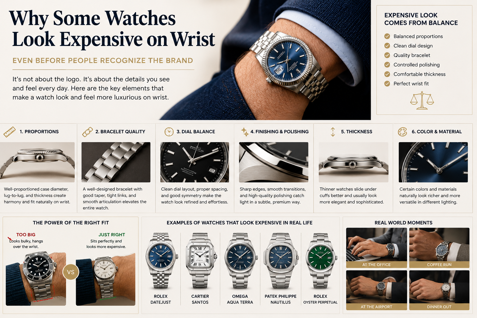
“Expensive Looking” Usually Means Balanced, Not Loud
A common mistake first-time buyers make is assuming that a watch needs to look flashy to feel luxurious.
In reality, most watches that look genuinely expensive are surprisingly restrained.
Think about the watches people quietly admire in real life:
- A blue Rolex Datejust under office lighting
- A steel Cartier Santos with a white dial
- An Omega Aqua Terra on a fitted bracelet
- A slim Oyster Perpetual with a clean black dial
None of these watches are overly aggressive.
They simply feel balanced.
That balance usually comes from:
- Proper proportions
- Clean dial spacing
- Bracelet integration
- Controlled polishing
- Comfortable thickness
- Good wrist fit
This is also why many people eventually move away from oversized watches. After the excitement wears off, proportion becomes more important than attention.
That is something discussed heavily in:
“Rolex Datejust Replica 36 vs 41: Which Size Looks Better for Daily Wear?”
Because in real life, the watch that gets worn most is usually the one that visually fits naturally.
The Bracelet Changes Everything
One of the biggest differences between a watch that looks “cheap” and one that feels premium is the bracelet.
Not the logo.
Not the movement.
The bracelet.
A well-designed bracelet changes how light reflects across the wrist. It changes comfort. It changes how the watch head visually flows into the arm.
This is why integrated-bracelet designs became so popular in the first place.
Watches like the Nautilus and Royal Oak created a more fluid, jewelry-like appearance compared to traditional sport watches.
That is also why many buyers start exploring pieces covered in:
“Best Nautilus Alternatives: Sporty Integrated-Bracelet Watches With Real Character”
The expensive feeling often comes from continuity:
- Smooth taper
- Tight bracelet links
- Minimal gap between case and bracelet
- Thin profile
- Brushed surfaces mixed with polished edges
Even modern replica factories focus heavily on bracelet quality now because buyers immediately notice it on wrist.
A mediocre movement can go unnoticed for months.
A bad bracelet gets noticed in five minutes.
Why Thin Watches Usually Feel More Premium
Thickness changes everything.
A thick watch often feels sporty, rugged, or tool-like.
A thinner watch usually feels more refined.
This is why watches like:
- Cartier Santos
- Rolex Datejust
- Oyster Perpetual
- Patek Nautilus
- Omega Aqua Terra
often appear more luxurious in everyday settings than huge dive watches.
They slide under sleeves better.
They sit flatter.
They move less aggressively on the wrist.
One buyer who originally purchased a large 44mm diver eventually switched to a 36mm Datejust-style watch after realizing he wore business shirts almost every day.
His reason was simple:
“The bigger watch looked impressive in photos, but the smaller one looked expensive in real life.”
That difference matters more than most people expect.
Dial Simplicity Often Looks More Expensive
Complicated dials can be impressive.
But clean dials usually age better visually.
There is a reason watches like the Rolex Oyster Perpetual have such a strong reputation despite looking extremely simple.
The simplicity creates confidence.
A clean dial allows:
- Better symmetry
- Better light reflection
- Better readability
- Better visual balance
This is also why many people eventually prefer smooth daily watches over heavily skeletonized or overloaded designs.
The same idea appears in:
“Best Rolex Oyster Perpetual Alternatives: Simple Watches That Still Feel Expensive”
Luxury often comes from restraint.
Not excess.
Polished Surfaces Matter More Than Most Buyers Realize
People usually notice polishing subconsciously.
They may not know why a watch feels expensive, but they react to how the surfaces interact with light.
Good polishing creates:
- depth
- edge definition
- sharper transitions
- cleaner reflections
This is why fluted bezels became iconic on the Datejust.
Under natural lighting, the bezel creates constant movement and reflection.
That effect is discussed in:
“Fluted Bezel vs Smooth Bezel on Replica Watches: Which One Looks More Expensive?”
Interestingly, even high-end replica factories now spend significant effort improving:
- bezel finishing
- brushing consistency
- polished chamfers
- bracelet edge transitions
Because visually, those details influence perceived luxury far more than most buyers initially expect.
Why Certain Colors Always Feel More Luxurious
Color changes perception immediately.
Some dial colors naturally feel:
- richer
- deeper
- cleaner
- more mature
For example:
- deep blue often feels refined
- silver feels timeless
- black feels sharp
- green feels modern and fashionable
But color also depends heavily on watch design.
A bright green sports watch may feel playful.
A dark green Datejust can feel extremely elegant.
That is why color guides have become increasingly important for buyers trying to choose their first serious watch.
And:
“Omega Seamaster Diver 300M Replica Guide: Blue, Black, White or Green — Which Style Fits You Best?”
In real life, dial color affects daily wear experience more than most specifications.
The Most Expensive-Looking Watches Rarely Try Too Hard
This is probably the biggest realization many enthusiasts eventually have.
The watches that consistently look expensive are usually the least desperate for attention.
A steel Santos can look more refined than a fully gold oversized chronograph.
A simple Oyster Perpetual can feel more elegant than a heavily customized sports watch.
A well-proportioned Aqua Terra can look more mature than an ultra-thick dive piece.
This is why understated luxury has become such a strong trend in both genuine and replica markets.
People increasingly want watches that:
- feel versatile
- work daily
- fit naturally
- look premium quietly
Not every buyer wants maximum attention anymore.
Many simply want a watch that feels right every time they wear it.
Why Wrist Fit Is More Important Than Brand Prestige
A poorly fitting luxury watch often looks less expensive than a properly fitting mid-range watch.
This happens constantly.
A large watch hanging over the wrist instantly destroys visual balance.
Meanwhile:
- shorter lug-to-lug dimensions
- proper bracelet taper
- moderate thickness
- correct case diameter
create harmony.
That harmony is what people interpret as “expensive.”
This is also why smaller watches have returned strongly in recent years.
You can see this trend clearly in:
“Tudor Black Bay 54 vs Black Bay 58: Which One Should You Buy First?”
Many buyers initially think they want bigger wrist presence.
Later, they realize comfort and proportion matter more long term.
Modern Replica Buyers Now Focus More on Feel Than Specs
One interesting shift in the replica watch world is that buyers increasingly care less about spec sheets and more about wrist experience.
A few years ago, most discussions focused on:
- movement names
- beat rates
- power reserve
- factory claims
Now the conversations are often about:
- bracelet softness
- case thickness
- crystal clarity
- dial texture
- bezel feel
- wrist comfort
Because those are the details people interact with every day.
That shift is part of why articles like:
“What Makes a Replica Watch Feel Expensive? 12 Details Buyers Should Check”
and:
“Super Clone vs Standard Replica Watch: What Are You Actually Paying For?”
connect strongly with modern buyers.
The emotional experience matters more now.
Not just specifications.
Expensive Presence Is Usually About Confidence
At the end of the day, watches that look expensive tend to share one thing:
They look comfortable being themselves.
They are not overloaded.
Not oversized.
Not trying too aggressively to impress.
Instead, they feel intentional.
That confidence often comes from:
- balanced proportions
- refined finishing
- wearable size
- clean design
- bracelet quality
- visual harmony
Ironically, many buyers only discover this after chasing louder watches first.
And once they experience a truly balanced watch on wrist, their idea of “luxury” changes permanently.
Because the watches that feel most expensive in real life are often the ones that quietly fit into everyday life the best.
